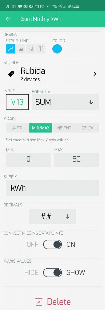
If you installed the Month App version, there is an additional ‘Monthly Usage’ graph on the ‘Measurements tab‘. This graph provides powerful daily and monthly structured information to compare the results of different heating strategies and mode selections to help you save money. The example screen-shot below illustrate this clearly:
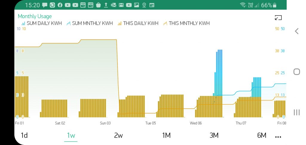
- The orange bars indicate the daily power usage profile (kWh) for the active geyser selected on the Settings tab.
- The
orange lineshows the monthly build-up of this energy usage (kWh) on a different scale. - The blue bars indicate the sum of the daily power usage for 2 (Tag) grouped geysers, also in profile over the day.
- The blue portion extending at the top is thus the additional usage by the second geyser.
- As can clearly be seen, geyser 1 (the active one) is switched on in the morning and the second grouped geyser is switched on at night.
- The
blue lineis the summed monthly build-up of this combined energy usage of the 2 geysers. - This can be fully customized for grouping any number of geysers together, typically for guest houses or lodges, etc. putting management in full control of the energy usage according to different heating strategies.